Well, here it is! This is the new site, and hopefully some of you are seeing it. It was quite a weekend of transitioning everything over, and I’m not so sure I’m done yet. I followed the guides and everything worked perfectly in the switch, until I then temporarily (or so I thought) disabled the custom domain from my Blogger account.
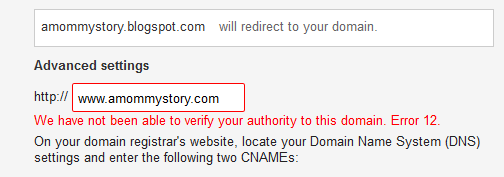
When I was ready to re-enable the custom domain on my old blog, so that anyone searching for any posts there would automatically be redirected to the new site, Google decided that it no longer believed that the domain was mine.
This red text plagued me all weekend.
Hours of trying all of their help docs to change custom fields in my DNS manager and repeated attempts to verify the domain and set it up, and nothing changed. I re-set the nameservers back, tried everything out there in source guides, and Google refused to verify the custom domain again.
(If you are non-techie and don’t follow a thing I’ve said so far, I’ll cut to the chase: I only made things worse.)
I finally gave up and decided I’d just post a “hey, I’ve moved” style post on the old blog and continue forward with everything here. I changed it all back…and then the www. version of my site decided it didn’t want to work. And Feedburner refused to switch my feed for me. I’m still working on these issues.
I no longer feel as mighty about making the switch on my own.
But here it is. I finally (FINALLY!) made the jump to WordPress. And it’s still very much a work-in-progress, so please excuse the changes you’ll continue seeing over the next few weeks. I’m not totally happy with the look (I never am, let’s be honest) and there are still some layout changes I need to figure out how to do.
So, what do you think?


Welcome to the new world! 🙂
It’s LOVELY!
I can see your blog! That’s a great place to start. LOL As far as (hopefully) constructive criticisms go, the ad boxes are definitely overwhelming. If it’s possible to up the contrast on your font (it’s a shade of gray right now) to something closer to black to help it stand out against all the advertisements, it might help. I don’t think, layout-wise, there’s not going to be much you can do to help avoid the advertisement problem, since I _do_ like the text on the left-hand side (I only have to pay attention to half the screen that way!). It’s just that your text fades into the background, and I want the whole world to be able to pay attention to your story! Also, I do like the color scheme at the top! 🙂 I’m not a pink sort of person, but I have to admit there’s appeal in setting pinks against browns and golds.
My $0.02! Congratulations on making the switch, and I wish you lots of success with your new digital space! <3
Also, just to clarify, if you deliberately picked gray out as the font color and that’s what it’s supposed to be, I didn’t mean to make it sound like you didn’t notice what you did! It’s just that I wanted to make sure that it’s supposed to be gray, in case for whatever reason my browser made some weird thingamawhatsit happen to the font, since I know scant little about coding and things of that nature. If the font is actually dark/black, then nevermind me, my browser’s wacky. If it is gray, then, yes, it’s a little fade-y. …I hope that helps? Either that, or I’ve just spent way too much time clarifying something that didn’t need to be explained away… This will be my little moment of awkward for the day. Don’t mind me!
No, no, constructive criticism is totally OK with me! The fonts and colors are still the defaults with this theme and on my list for the second round of edits to the site. I agree, the color is a little too light. And I may swap the two sidebars so the skinny one is in the middle.
And yeah, pink generally isn’t my color, but next to the brown and gold it works out pretty well. I may still change the colors eventually (as well as get a professional header designed!) but it works for the moment. 🙂
Hi there! I clicked over from Jonniker’s Twitter feed and have enjoyed reading! I just had to comment and say Hi, we are blog theme twins! I co-write a blog with three friends and we also found the happy colors of Lucious Child too peppy to pass up (though the theme name still seems a bit… unfortunate). We haven’t figured out what to do with our banner, we don’t have a logo yet. Love what you have done with yours, the stripes look awesome! (we won’t copy you, swearsies, that’d be uncool). Alway, hello blog twin! That is all 🙂